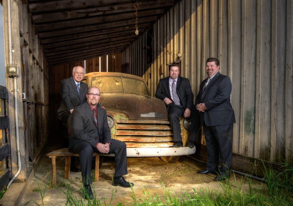
I’ve had some people asking me how I created the CD album artwork for Justified Quartet. Well, that’s actually a fairly complex question because it was a complex project. So, I decided to break it down for you with progressive photos!
First of all is the photo shoot itself. We shot in two different locations: an old industrial park and a rustic barn. It was important for us to find a location that fit the album’s direction. I wanted a spot that artistically fit the guys and the “feel” of the album. In this case, they were going with some of those old-time beloved hymns. So, something rustic was fitting which is why I suggested these two locations. As you can see below, my photo library ended up with 251 total shots between the two locations. Believe it or not though, that was AFTER I sorted out the rejects! It took well over an hour just to narrow down and thin out the obvious fail shots. We took both group and individual shots that they could use for the album and other promotional needs. My guess is that we had over 400 photos.
Next, I began doing basic editing work on a handful of group shots. Now, if I did full-blown editing on all the group shots that I liked, it would have taken several days of work. Rather than do this, I did some basic editing of the shots so we could first narrow down our options. I did this with about 7 different scenes of the group to offer them a variety of options. Just to compare, below is the completely basic out-of-camera shot we ended up using for our starting point. Nothing very exciting is it?
Next we must decide which direction we want to go with our selected photo. The photo below for example shows 4 very different processing techniques we could have used if we wanted to. The top right is actually the finished copy we used. I didn’t keep the basic edit for reference.
Now it’s time to get into the advanced editing stage. We know the photo and artistic direction so it’s time to get into Photoshop. Let me assure you of something, most people vastly underestimate the time we photographers (or at least the picky ones) spend in post-processing! For example, I wanted the old truck and barn to really pop so I did HDR processing on it. FYI, HDR stands for high dynamic range and it involves blending several photos taken at different exposure levels to come up with a more detailed shot overall. The good news is that this works great for old trucks and barns. The bad news is that this makes people look REALLY BAD!
The photo below is after HDR processing. Notice how it distorts the faces, bodies, and suits. NOT good! But the truck and barn look better.
So, now I have to blend in another image. I need to bring back the non-HDR photo so the guys look normal again but “mask out” the truck and barn so it retains its added pop. This takes quite a bit of time. Notice below that we now have the HDR truck and barn and the normal photo of the guys.

So, we’re done, right? Nope! Now it’s time to do lots of localized adjustments. One persons face is darken than another’s due to lighting so you fix that. The ground beneath the truck is too bright and distracting so you fix that. The barn wall is too big and bland on the right so you do some adjusting there. Then, the photo is still missing zeal so I overlay a texture layer (again, not on the guys though). Then I do selective dodging and burning (brightening and darkening) to bring out or make more subtle certain parts of the image. If you’re a Photoshop person you’ll appreciate the layers panel below. Each of these is a different adjustment made throughout the photo and it doesn’t include the layers and editing already done in the HDR process.
But, look at the difference. Compare the photo below with the previous. BIG difference, right?
So, we’re still not done. Next we get the layout template from the company making the CD wraps. Back into Photoshop! Now we create the inside portion with their individual photos, the back with the song titles, and the CD flap that will hold the CD in place. More layers, more effects, more photos, more dodging and burning. I included labels on the photo below so you can see how it comes together. All of this must be precise and you’re looking for fonts and colors that all complement each other well and fits the overall theme.
And so, now you see the final product of our cover. Yes, this was the abbreviated version of what all took place, but this should give you a feel for what it takes to put something like this together. It is a lot of work but I think this was a quality job worth the effort. These guys are awesome and I’m proud to say I was able to work on their album artwork!